Incorporating customer feedback, portal becomes more user-friendly and efficient.
We’ve been working on this portal update for a while now, and are truly excited to finally roll it out to our user base. Its evolution was in part driven by customer feedback and requests, and in part driven by a desire to make the UI simpler and more efficient, wherever possible.
Beyond its fresh look, here are some of the key improvements you should take note of, as you explore our new interface:
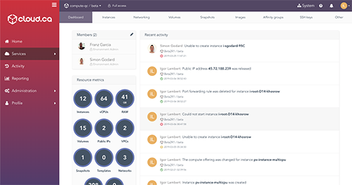
New landing page
- This page provides a front-and-center view of the health of the various cloud.ca services, a recap of your team's recent activities, and a few key shortcuts. Any important announcements from our team will automatically appear here as well, so you can't miss them! (image above)
Vertical navigation bar (left-side)
- As we add more and more options to our platform, leveraging vertical browser scrolling becomes obvious. Note that you can easily collapse this sidebar (hamburger icon at the top) to gain even more space when managing your cloud resources.
Overhauled "Services" tab
-
Each environment now sports its own dashboard tab which presents an overview of its provisioned resources, members and recent activities.
-
Complex operations that used to be split in multiple distinct steps are now presented in a single simplified page. Advanced features are still there, but strategically positioned in expandable sections.
-
Navigation has also been dramatically improved between the different entities, and most displayed values can be quickly copied to your clipboard in a single click.
-
For those who leverage APIs and automation, we've added a new tab titled "Other", where you'll quickly find all details about available compute/storage/network offerings.

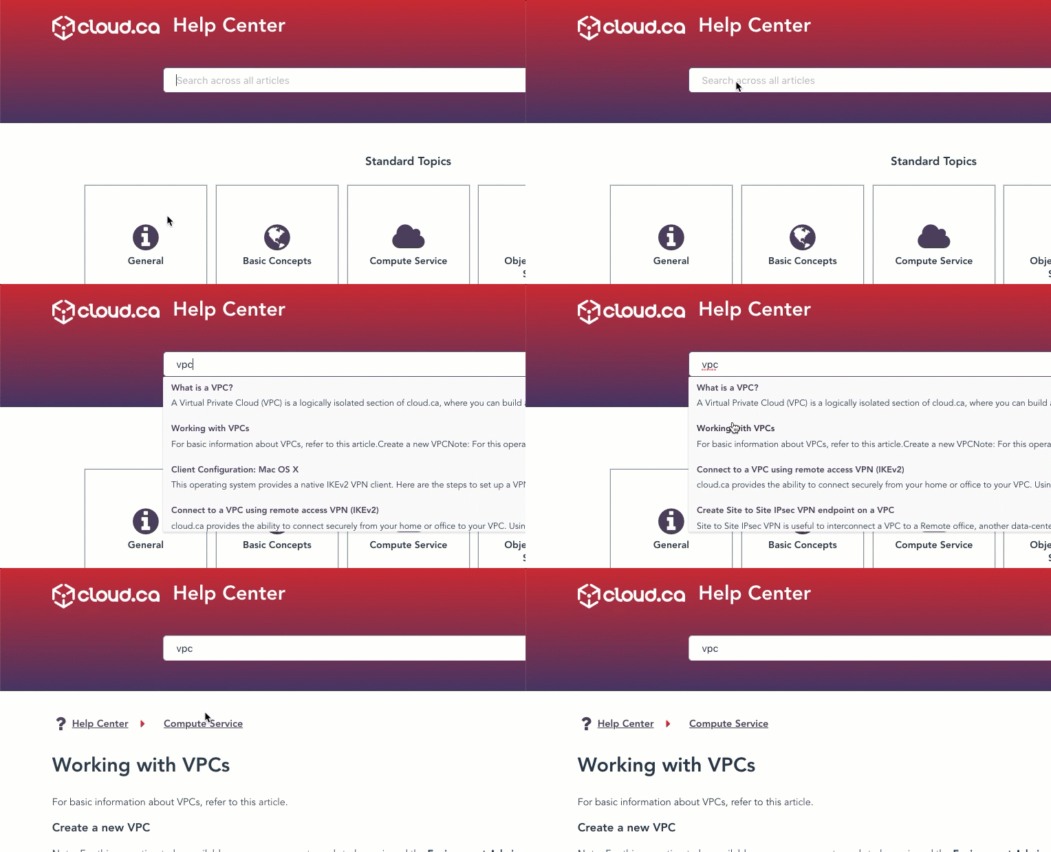
Searchable knowledge base
-
The Help Center is your go-to place when looking for information on how to best leverage the features offered by cloud.ca. All articles in the knowledge base are now fully searchable, to find your desired content more quickly.

Object storage drag and drop
-
We've simplified the upload process, as you can now drag and drop files from your desktop directly into a bucket or even a specific folder, and completely bypass the upload dialog.
New support platform
-
We're now using Jira ServiceDesk as our preferred support mechanism. If you need any assistance from our team, you can simply open a new ticket from the "Contact support" option in the top nav-bar of the portal. We will continue to improve this integration over the next few quarters.
Notification sidebar
- Real-time notifications are now channeled through a new sidebar on the right, which you can conveniently toggle on and off via the bell icon. You'll find that the information displayed here is now more complete and uses more efficient layout.
Our commitment is to keep on improving our platform to better serve our customers. To get started and check out cloud.ca's new UI, start a trial or contact us.

.png?width=1250&name=image%20(14).png)


